7 Digital Menu Board Design Mistakes to Avoid
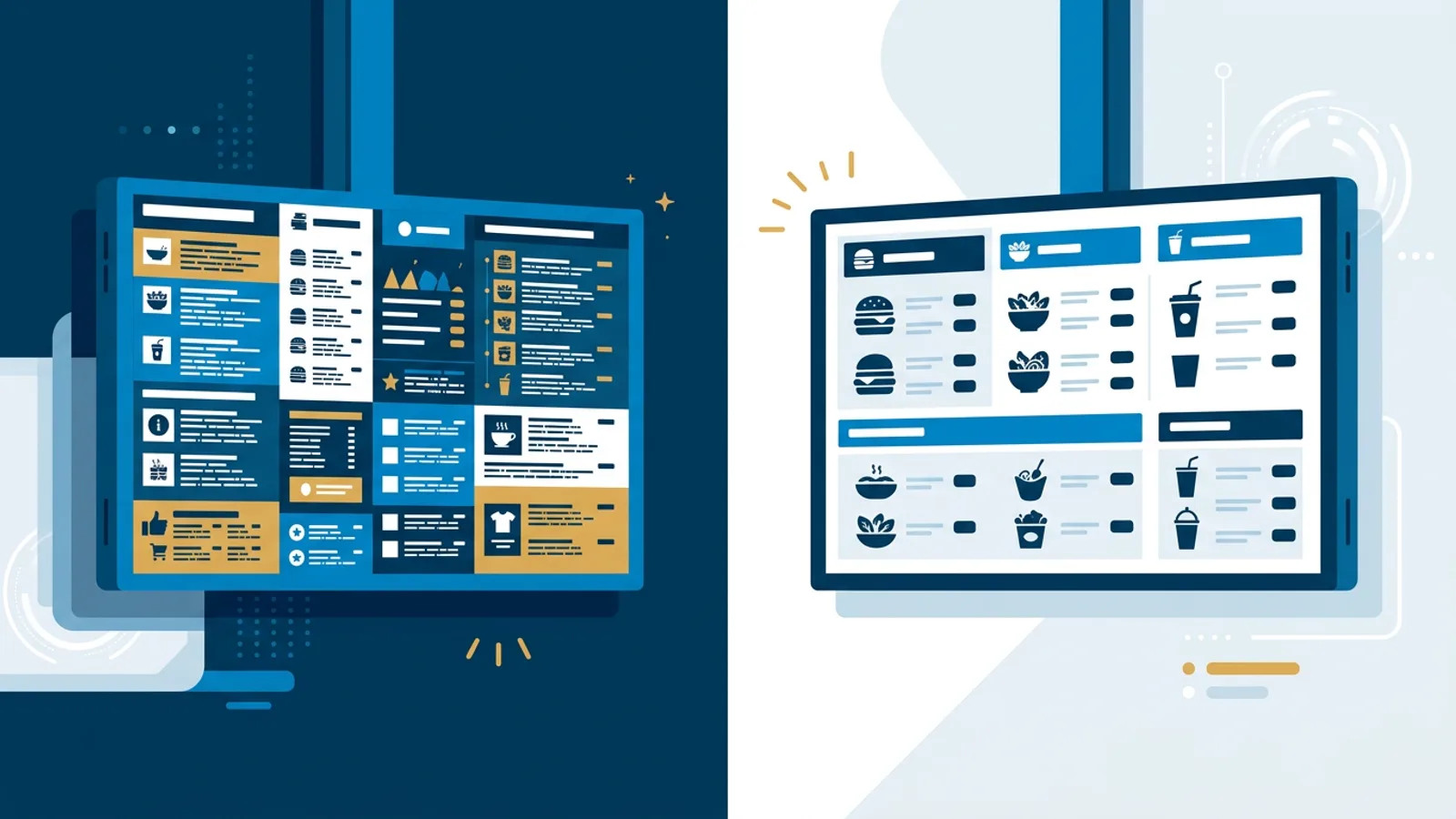
A digital menu board is only as good as its design. Swap a printed board for a screen and change nothing else, and you often end up with something worse: harder to read, slower to scan, and more distracting than helpful. Good digital menu board design follows a few consistent rules, and most of the boards that fail break one of the same seven of them.
If you're still setting up the hardware side of things, our guide on building a digital menu board covers players, screens and mounting. This article is about what goes ON the screen once it's running.
Mistake 1: Cramming in the entire paper menu
The most common menu board design mistake is treating the screen like a printed menu you photographed and uploaded. A paper menu can hold 40 items in small type because customers hold it, read at their own pace, and can flip back. A screen gets glanced at for a few seconds from a few feet away, often while someone is deciding what to order in a moving line.
Fix: cut the item list down to what actually sells, or split it across a small rotation of screens or slides. Group by category (mains, sides, drinks) rather than trying to show everything at once. If you have a big menu, consider a static "full menu" board plus a rotating screen for specials and promos.
Mistake 2: Font sizes that don't survive distance
Designers often build menu screens while sitting 60cm from a laptop, then wonder why nobody can read the prices from the counter. Text that looks fine up close can be unreadable from 3 to 5 meters away, which is the realistic viewing distance in most quick-service setups.
A rough rule: item names should be large enough to read comfortably from the farthest point a customer stands to order. Prices need almost as much size as names, since price is often the second thing people scan for after the item itself. If you're unsure, print the layout at actual screen size, tape it to the wall, and walk backward until you can't read it. That's your real limit, not the size that looks good on your monitor.
Mistake 3: No visual hierarchy
When every item, price and description is styled identically, the eye has nothing to land on. Good menu boards guide attention on purpose: category headers are bigger and bolder than item names, item names are bigger than descriptions, and prices are consistent in position so people can scan down a column instead of hunting for them.
A simple hierarchy checklist:
- Category headers: largest, boldest, consistent color
- Item names: second tier, consistent weight
- Descriptions: smallest, optional, only where it adds real information
- Prices: aligned in a single column or consistent position, not scattered
Pick two or three things per screen that deserve visual weight (today's special, a combo deal) and let the rest sit quietly in the background.
Mistake 4: Fighting the screen's aspect ratio
Most TVs are landscape 16:9, but a lot of menu content (a tall list of drinks, a narrow specials board) is naturally portrait-shaped. Squeezing a portrait layout into a landscape screen usually means huge empty margins on the sides, or text stretched awkwardly to fill space.
Fix: decide orientation before you design content, not after. If your menu is naturally a tall list, mount the screen in portrait and design for that. If it's a wide grid of categories, landscape works better. TVpilot supports both landscape and portrait scheduling per screen, so you can match the layout to the content rather than forcing content to fit whatever orientation the TV happened to ship in.
Mistake 5: Too much motion and clutter
Animated backgrounds, scrolling tickers, autoplay videos and flashing "NEW!" badges all fight for attention at once, and the result is visual noise that makes the menu harder to parse. Motion works when it's used sparingly, for one thing you actually want noticed (a limited-time offer, a rotating slide of 3-4 specials). It stops working the moment three different elements are moving at the same time.
A useful test: if you can't tell a stranger where to look first within one second of glancing at the screen, there's too much competing for attention.
Mistake 6: Ignoring lighting and glare
Design choices that look great in a design tool can become invisible in the actual room. Dark backgrounds under bright ceiling spotlights turn into a mirror. Low-contrast pastel text on a white background disappears near a sunlit window. Menu boards need to be designed with the installation location in mind, not just the screen in isolation.
High-contrast color pairs (dark text on light background, or the reverse) generally hold up better under variable lighting than subtle gradients or low-contrast branding colors. If the board sits near a window, test it at different times of day before finalizing the layout, since morning glare and evening glare hit differently.
Mistake 7: Never updating it
A menu board that's technically "digital" but never changes offers none of the advantages over print and adds a screen to maintain for nothing. Seasonal items linger for months after they're gone, prices go stale, and regular customers stop bothering to look at it because they've learned it never changes.
This is usually a workflow problem: whoever built the original board isn't the person running the restaurant day to day, so updates never happen. Fix it by making updates something a manager can do without touching a design tool. TVpilot's AI Studio generates a designed menu screen from a short text brief, so seasonal swaps or price changes don't require re-opening a design file every time. Scheduling per day and time slot also handles the routine cases automatically, like breakfast menus swapping to lunch at 11am without anyone touching the dashboard.
A quick before/after checklist
| Mistake | Symptom | Fix |
|---|---|---|
| Overcrowded menu | Customers squint, ask staff to read it out | Cut to bestsellers, rotate the rest |
| Small text | Unreadable past 2 meters | Test at real viewing distance |
| Flat hierarchy | Nothing draws the eye | Size/weight tiers for headers, items, prices |
| Wrong orientation | Empty margins or stretched text | Match orientation to content shape |
| Too much motion | Feels chaotic, hard to focus | One moving element at a time |
| Poor contrast | Invisible under glare | High-contrast color pairs |
| Never updated | Stale prices, ignored by regulars | Simple update workflow, scheduled swaps |
When TVpilot is (and isn't) the right fit
If you want to design a menu screen without hiring a designer, and you want a manager to be able to swap specials or fix a price without opening a design tool, TVpilot's AI Studio and scheduling cover that well, and it works on a Raspberry Pi player or straight in a browser on a smart TV. It isn't for everyone, though: TVpilot is hosted software, not something you self-host, and there's no dedicated native app for Fire TV or Android TV yet (those run via the browser). If you specifically need offline-first playback with zero internet dependency, that's a real constraint worth weighing, since players need connectivity to pull content updates.
For a single small screen, the free plan (1 screen, 500MB storage, no card required) is enough to try the whole workflow before committing to anything.
Getting it right
None of these seven mistakes require design talent to fix, just discipline and a workflow that makes updates painless enough that they happen. If you'd rather start from a template than a blank canvas, our step-by-step walkthrough on making a digital menu board covers the build process end to end. When you're ready to put a screen live, sign up and try the free plan first.
Frequently asked questions
What's the biggest digital menu board design mistake restaurants make?
Cramming the entire printed menu onto the screen. A paper menu is read up close at a customer's own pace; a screen is glanced at from a few meters away for a few seconds. Cutting the list down to bestsellers and rotating the rest almost always improves readability more than any font or color change.
What font size should I use on a digital menu board?
There's no single number because it depends on screen size and viewing distance, but the practical test is to print your layout at actual screen size, tape it up, and walk backward from the counter until you can't read it comfortably. If that distance is shorter than where customers actually stand, increase the size until it matches.
Should a digital menu board be landscape or portrait?
It should match the shape of the content, not the default orientation of the TV. A tall list of drinks or a narrow specials board usually works better in portrait, while a wide grid of food categories often suits landscape. Decide this before designing the layout, since retrofitting content into the wrong orientation usually means stretched text or wasted margins.
How often should a digital menu board be updated?
As often as prices or availability actually change, which for most restaurants means at least seasonally and immediately when a price or item changes. The real fix is workflow: if updating the board requires reopening a design file, it will get neglected. Tools that let a manager swap content from a simple dashboard, or schedule swaps by time of day, keep boards accurate without extra effort.