Digital Signage Font Size: How Big Is Big Enough?
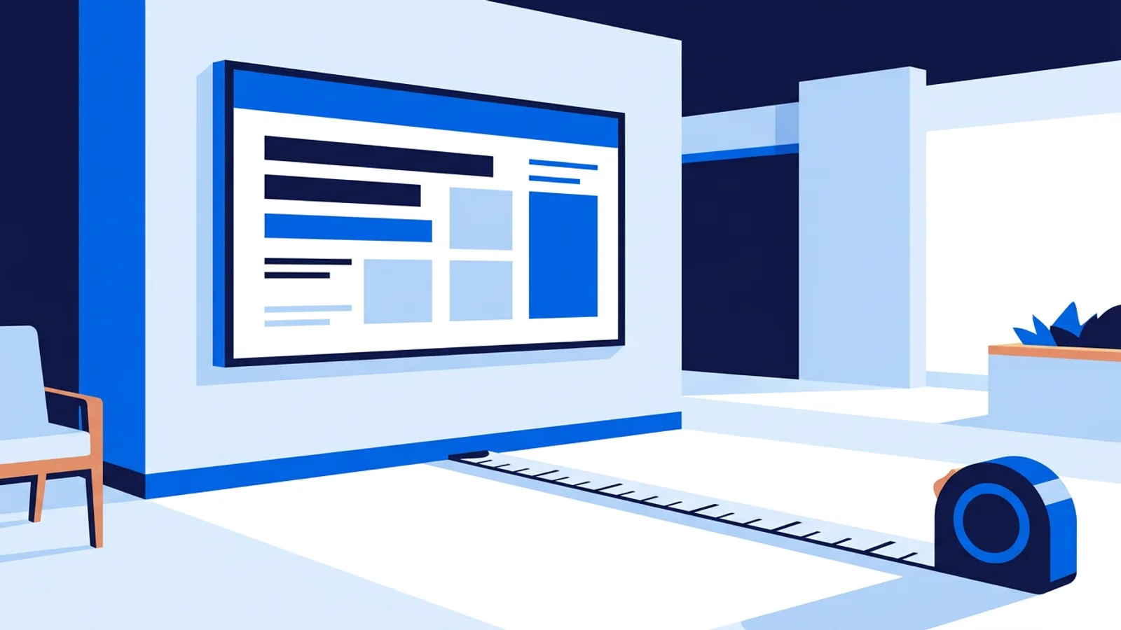
Most digital signage font size problems come from designing on a laptop at arm's length instead of testing on the actual TV from the actual viewing distance. The short answer: body text should be roughly 1 inch of letter height for every 10 feet of viewing distance, and headlines should be noticeably bigger than that. Everything else in this guide is the math and the exceptions.
If you're setting up screens for the first time, pair font sizing with a digital signage platform that lets you preview layouts before they go live on a real TV, rather than guessing from a browser tab.
The viewing distance rule for digital signage font size
Signage designers have used a simple ratio for decades, borrowed from outdoor billboard and wayfinding design: letter height in inches should scale with how far away your audience stands or sits. Two versions of the rule matter depending on what you're asking people to do:
- Glance rule (attention only): roughly 1 inch of letter height per 3 to 4 feet of distance. Use this for headlines, prices, or anything meant to register in a second or two.
- Read rule (actual reading): roughly 1 inch of letter height per 8 to 10 feet of distance. Use this for body copy, ingredient lists, or anything people are expected to stand and read.
Here's how that translates into real-world distances:
| Viewing distance | Minimum letter height | Typical use |
|---|---|---|
| 3-5 feet (front counter, kiosk) | 0.5-1 inch | Menu prices, small print, secondary info |
| 6-10 feet (waiting room, lobby) | 1-1.5 inches | Body copy, schedules, directory listings |
| 10-20 feet (hallway, retail floor) | 1.5-3 inches | Headlines, promo text, wayfinding |
| 20+ feet (drive-thru, warehouse) | 3+ inches | Single words, big numbers, icons |
Letter height is not the same as point size. As a rough conversion, a font's cap height is usually about 70% of its point size on screen, so if you need 1.5 inches of letter height, you're looking for something in the neighborhood of a 2-inch point size once you account for the font's internal spacing. The only reliable way to confirm it is to put the actual layout on the actual screen and stand where your audience will stand.
Why pixel and point sizes don't transfer between screens
A 32pt heading looks huge on a 24-inch monitor and disappointingly small on a 65-inch TV mounted 15 feet up a wall. Font size in a design tool is relative to the canvas, not to physical inches on the wall. A screen's actual size and resolution determine how many real-world inches a given point size occupies.
This is why signage projects look fine in the office and unreadable in the lobby: the designer never tested on the destination screen at the destination distance. If you're building layouts for multiple screen sizes, either design each one at native resolution and check it in place, or set your defaults conservatively large and treat "looks a bit oversized on my monitor" as a good sign rather than a mistake.
Best fonts for digital signage
Font size only works if the font itself holds up on a TV panel, which handles fine detail worse than print or even a desktop monitor. A few practical rules:
- Use sans-serif fonts for anything read at a distance. Serifs (the small feet on letters) blur together on TV panels and at odd viewing angles. Reserve serif fonts for short, large, close-up branding text if you want that look.
- Pick fonts with open letterforms. Look for a clearly open "a", "e", and "s" rather than tightly closed shapes. Condensed or ultra-thin weights save space but lose legibility fast at distance.
- Avoid font pairs closer than a clear weight contrast. If you're using two fonts, make sure one is obviously bolder or larger than the other, otherwise the hierarchy collapses on a screen viewed from across a room.
- Stick to system-safe or well-hinted web fonts. Obscure decorative fonts can render with rough edges when scaled to fill a TV, especially on lower-cost media players.
- Test at your actual color combination. Font size and font choice interact with contrast; a well-sized font on a poor color pairing still reads badly. That's a big enough topic on its own, and it's covered in Digital Signage Color Contrast: What Works on a Real TV.
TV screen font size in practice
A few situational notes that come up constantly once screens are installed:
Menu boards and price lists. These get read up close and scanned quickly, so a mix of the glance rule (category headers) and the read rule (item descriptions) usually works. If you're building one from scratch, How to Make a Digital Menu Board walks through layout and hierarchy in more depth.
Lobby and reception screens. People usually sit or stand for 10-30 seconds, close enough to read but not staring. Err toward the larger end of the read rule, and keep line counts low so nobody has to squint through a paragraph. There's a dedicated breakdown in Welcome Screen Design for Your Lobby or Reception.
Portrait screens. Vertical orientation changes how much horizontal space you have for a line of text, which usually means shorter lines and, often, slightly larger type to fill the narrower width without looking sparse. If a design was built for landscape, don't rotate it and hope; re-check every font size against the new proportions.
Safe margins. Keep body text at least 5% of screen width away from every edge. Some TVs overscan slightly, and text jammed into a corner is the first thing that gets clipped.
General layout and hierarchy principles (not just font size) are covered in Digital Signage Design Best Practices for Readability, which is worth reading alongside this if you're setting standards for multiple screens.
Common font size mistakes
- Copying a print flyer onto a TV screen. Print is read at 12-18 inches; a TV is read from across a room. The same font size that works on paper is almost always too small on a screen.
- Filling the frame with text because "there's room." Digital signage isn't a webpage. Fewer words at a bigger size beats a dense paragraph every time.
- Designing only on a laptop. If you never preview on the destination TV, you're optimizing for the wrong viewing distance.
- Ignoring ambient light and glare. Bigger fonts partially compensate for a bright window or harsh overhead lighting, but they don't fix bad contrast, so size and color choices need to be solved together.
When a signage platform helps, and when it doesn't
A tool like TVpilot helps mainly because it lets you build and preview a layout in the dashboard, push it to the real screen, and see it exactly as your audience will see it, rather than mailing a file to whoever is standing near the TV. TVpilot's AI Studio can also generate a designed screen from a short brief (menus, promos, welcome screens) with sensible sizing already applied, which is a reasonable starting point if you don't want to fuss over exact point sizes yourself. It runs on a Raspberry Pi with a one-command installer, or in any modern browser on a smart TV, Fire TV Stick, or old laptop, and the free plan (one screen, 500 MB storage, no card required) is enough to test a single lobby or counter screen before committing to anything larger.
What it won't do is fix a bad font choice or an undersized layout for you. If your only problem is "what size should this heading be," you can solve that with a tape measure and the ratios above on any tool, including free ones covered in Free Digital Signage: What You Actually Get in 2026. TVpilot earns its keep once you're managing more than one screen, need scheduling, or want content to update itself without someone re-exporting a file every week.
Get the font size right first: measure the real viewing distance, apply the ratio, and preview on the actual screen before you finalize anything. Once the layout is sized correctly, sign up for TVpilot to push it live, schedule it, and manage it from one dashboard instead of a USB stick.
Frequently asked questions
What is the minimum font size for digital signage?
There's no fixed pixel number because it depends on screen size, resolution, and viewing distance. As a rule of thumb, use about 1 inch of letter height for every 8 to 10 feet of distance for text people need to read, and 1 inch per 3 to 4 feet for headlines meant to just grab attention. Always confirm on the actual screen at the actual distance.
How do I calculate the right font size for a TV screen?
Measure the typical distance between the screen and your audience, then apply the viewing distance ratio: roughly 1 inch of letter height per 10 feet for body text, or per 3 to 4 feet for large headline text. Convert that letter height to a point size (letter height is usually about 70% of point size), then verify it on the real TV since point size on a design canvas doesn't map directly to physical inches on different screens.
What are the best fonts for digital signage?
Sans-serif fonts with open letterforms generally hold up best on TV panels and at a distance. Avoid condensed or ultra-thin weights for anything read from more than a few feet away, and make sure any two fonts you pair have a clear contrast in weight or size so the hierarchy stays obvious across a room.
Does font size need to change for portrait screens?
Usually yes. Portrait orientation gives you less horizontal width per line, which often means shorter lines of text and sometimes a slightly larger font size to avoid the layout looking sparse. Never just rotate a landscape design and assume the sizing still works; re-check it against the new proportions.