Digital Signage Design Best Practices for Readability
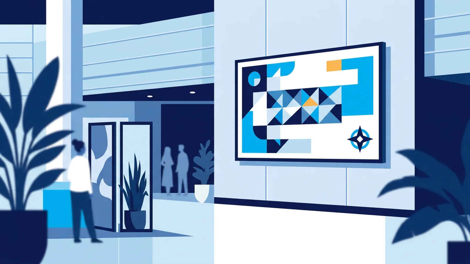
Most digital signage looks bad from ten feet away because it was designed on a laptop, from eighteen inches away, and never tested anywhere else. Digital signage design best practices all come back to one test: can someone read this while walking past, from across a room, without stopping? If not, the layout needs work before the content does.
A screen that requires people to walk up and squint is worse than no screen at all, because it wastes the real estate and the attention you paid for. Whether you're running a single lobby TV or managing a chain of menu boards from a dashboard like TVpilot, the same handful of rules decide whether your signage communicates or just flickers in the background.
Digital signage design best practices start with distance, not devices
Before you pick fonts or colors, figure out how far your average viewer will be from the screen. A reception desk TV might be read from three feet away. A menu board above a counter might be read from fifteen feet. A lobby display in a large office might need to work from thirty feet, across an atrium.
This single number should drive every other decision: text size, line count, image detail, even screen orientation. Designing for the wrong distance is the most common mistake in signage, more common than bad color choices or clutter.
As a rough starting point, here's how text size needs to scale with viewing distance for a typical adult with normal vision:
| Viewing distance | Minimum text height | Practical use case |
|---|---|---|
| 3-5 ft | 0.5-1 inch | Reception desk, checkout counter |
| 6-10 ft | 1-2 inches | Menu board, waiting room |
| 10-20 ft | 2-4 inches | Lobby, hallway, retail floor |
| 20-30 ft | 4-6 inches | Warehouse, large office, gym |
These are minimums, not targets. If in doubt, go one size category up. Nobody complains that text is too easy to read.
Contrast does more work than color choice
Designers often reach for a brand color palette first and readability second. That's backwards. Contrast between text and background matters more than which colors you use. Dark gray text on a light gray background looks clean in a mockup and becomes nearly invisible on a TV under fluorescent lighting or direct sun through a window.
A few practical rules:
- Use near-black text on near-white backgrounds, or the reverse, as your default. Save subtle color pairings for decorative elements, not the message itself.
- Avoid text over busy photos unless you add a solid or semi-transparent panel behind it.
- Test your screen in the actual lighting it will live in, not just on your desk. A screen that looks fine in an office at 2pm can wash out completely near a storefront window at noon.
- If your brand colors are genuinely low-contrast (light blue on white, for example), reserve them for logos and borders, not body text.
Layout: fewer zones, bigger everything
A common instinct is to fill the screen: weather in one corner, a news ticker along the bottom, a promo video in the middle, a logo up top. Each element on its own might be readable. Together, they compete for attention and none of them win.
Good signage layout usually has one to three zones, not five or six. A simple pattern that works:
- One primary zone taking up 70-80% of the screen for the main message (a menu, a promo, a welcome screen).
- Optionally, a slim secondary strip (weather, time, a short scrolling line) that supports but doesn't compete.
- A small, consistent logo or brand mark in a corner, not blocking content.
If you're building a menu board specifically, the same principle applies with extra emphasis on price legibility and category grouping. We've covered that in more detail in 7 Digital Menu Board Design Mistakes to Avoid, which is worth reading alongside this if food service is your use case.
Motion and transitions: use sparingly
Animated transitions and moving backgrounds draw the eye, which sounds good until you realize they draw the eye away from the text you want read. A slow crossfade between slides is usually enough. Sliding, spinning, or zooming transitions add visual noise without adding information.
The same goes for video backgrounds behind text. They look impressive in a portfolio and they're distracting in a hallway where someone is trying to read a room number or a wait time.
Content hierarchy: one message per screen, one idea per slide
If a slide has three things to say, it says none of them well. Signage is scanned, not read. Give each slide a single clear message: today's special, the wifi password, a welcome greeting. Save the secondary information for a following slide in the same playlist rather than crowding it in.
A practical hierarchy for any signage slide:
- Headline: the one thing people need to know, large and high-contrast.
- Supporting detail: a price, a time, a short sentence, noticeably smaller than the headline.
- Brand element: logo, small and out of the way.
This also makes content easier to update. When each slide has one job, swapping out a promo or a price is a five-minute edit instead of a redesign.
Orientation and aspect ratio
Landscape is the default for most TVs, but portrait orientation suits certain content better: menu lists, directories, retail promos next to narrow aisles. Whichever you choose, design for it deliberately rather than rotating a landscape template and hoping it still works. Text that wrapped nicely in landscape often gets awkward in portrait, and vice versa.
If you're managing multiple screens with different orientations (a landscape lobby TV and a portrait window display, for example), keep that in mind when building templates so you're not fighting the layout every time you switch.
Where a tool like TVpilot fits, and where it doesn't
Good design principles apply no matter what software runs your screens. But some tools make it easier to apply them consistently, and some make it harder.
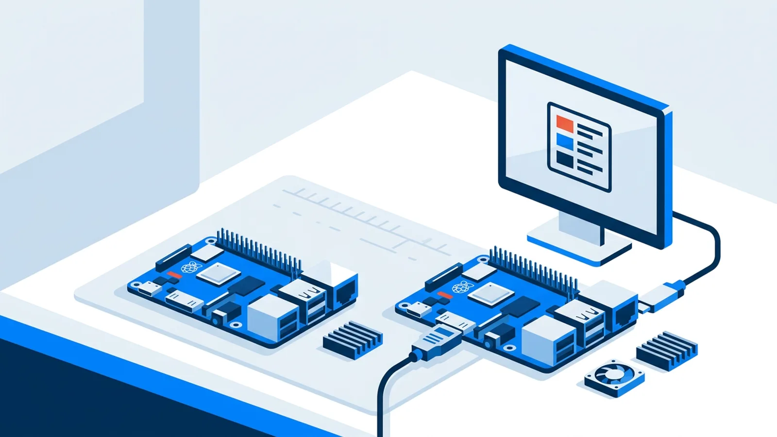
TVpilot is a good fit if you want a straightforward way to schedule and update content across one screen or dozens, without maintaining your own server or writing your own player software. It runs on Raspberry Pi hardware with a one-command installer, or on any device with a browser, including smart TVs and Fire TV Stick via its browser app. Its AI Studio can generate a designed screen (a promo, a menu, an opening-hours notice) from a short brief, which is a fast way to get a readable, well-structured layout without hiring a designer. Scheduling, playlists of images/videos/web pages/PDFs, and remote monitoring are built into the dashboard.
It's probably not the right fit if you need a fully self-hosted, open-source setup: TVpilot is hosted SaaS, not something you install on your own infrastructure. It also doesn't yet have a dedicated native app for Android TV or Fire TV; those run through the browser instead. And because it's cloud-managed, players need an internet connection to pick up content updates (the Raspberry Pi player does recover automatically once connectivity returns, but there's no fully offline mode).
If your main goal is getting readable content on a screen without babysitting individual devices, that's the gap this kind of tool closes. If you're set on a fully DIY, self-hosted stack, a Raspberry Pi with your own kiosk setup is a legitimate route too, and we've written a full walkthrough of that approach in the Raspberry Pi Digital Signage Guide.
A quick before-you-publish checklist
Before any slide goes live, run through this checklist:
- Stand at the actual viewing distance and read it without walking closer.
- Check contrast under the real lighting conditions, not your desk lamp.
- Count the ideas on the slide. If it's more than one, split it.
- Confirm the text isn't sitting over a busy part of a background image or video.
- Check it on the actual orientation (landscape or portrait) it will run in, not a rotated preview.
None of this takes long, and it catches almost every readability problem before a customer or employee has to squint at it. If you want to put these rules into practice without building your own player software from scratch, sign up for TVpilot and try it on a single screen for free.
Frequently asked questions
What is the minimum text size for digital signage?
It depends on viewing distance, not a single fixed number. As a rough guide, use about 0.5-1 inch of text height for screens read from 3-5 feet away, 1-2 inches for 6-10 feet, and 2-4 inches or more for lobby or hallway displays viewed from 10-20 feet. When in doubt, size up rather than down.
Why does my digital signage look fine on my laptop but bad on the TV?
Laptop previews are usually viewed from 18-24 inches away under controlled lighting, which hides contrast and text-size problems that only show up at real viewing distances and under real store or office lighting. Always preview content on the actual screen, in the actual location, before publishing.
How many messages should one digital signage slide have?
One. Signage is scanned quickly, not read carefully, so a slide with a single clear headline (plus maybe one small supporting detail) communicates far better than a slide trying to show a promo, a schedule, and a logo message all at once. Split multiple ideas into separate slides in the same playlist.
Does digital signage design change for portrait screens?
Yes. Portrait orientation suits lists, menus, and directories well, but text and layouts that work in landscape often wrap awkwardly or look cramped when simply rotated. Design portrait templates from scratch rather than reusing a landscape layout, especially if you're running both orientations across different screens.