Digital Signage Color Contrast: What Works on a Real TV
A color scheme that looks crisp on your laptop can turn muddy, glaring, or unreadable once it's on an actual TV bolted to a wall six feet from the nearest viewer. Getting digital signage color contrast right means accounting for TV panel behavior, ambient light, and viewing distance, all at once. Most signage software, including a dashboard like TVpilot, will happily display whatever colors you upload, so the responsibility for making them legible sits with you, not the tool.
This guide covers what actually changes when content moves from a design file to a TV screen, and gives you contrast combinations and layout habits that hold up in real rooms, not just on a calibrated monitor.
Why TVs don't render color like your monitor
Consumer TVs are tuned for movies and sports, not text. Manufacturers push saturation, contrast, and sharpness higher than a monitor would, because it looks punchy in a showroom. That means:
- Reds and oranges often bloom or bleed slightly at their edges.
- Pure white backgrounds can appear slightly blue or produce visible backlight bleed near the edges, especially on cheaper LED panels.
- Local dimming zones on some TVs dim the whole area around a small bright object, which can make thin white text on a dark background flicker or pulse subtly.
- Color accuracy varies a lot between a $250 TV and a $1,200 one, and you rarely control which TV your sign ends up on.
In practice, don't design around subtlety. Fine gradients, pastel-on-pastel text, or low-saturation branding that reads fine on a MacBook screen can disappear entirely on a budget commercial display.
The contrast ratio problem: web rules don't fully apply
Web accessibility guidelines (like WCAG) recommend a contrast ratio of at least 4.5:1 for normal text. That's a reasonable floor, but signage needs more headroom for two reasons: viewers are further away, and they're not stopping to read carefully, they're glancing.
As a working rule for digital signage colors:
- Body text and background: aim for at least 7:1, not the web minimum.
- Headlines and prices: as close to pure white-on-dark or dark-on-white as your brand allows.
- Avoid mid-tone-on-mid-tone combinations entirely (gray text on a blue-gray background is a common menu board mistake).
If you're building a menu board specifically, this compounds with layout problems too; we've covered the most common ones in 7 digital menu board design mistakes to avoid.
Combinations that hold up on a real TV
| Background | Text | Notes |
|---|---|---|
| Near-black (#0A0A0A) | White (#FFFFFF) | Safest high-contrast pairing, works in bright and dim rooms |
| Dark navy (#0F1B2D) | Warm white (#F5F5F0) | Slightly softer than pure black, good for lobbies |
| White (#FFFFFF) | Near-black (#111111) | Fine in bright rooms, can glare in dim ones |
| Brand color (dark, saturated) | White | Only if the brand color itself is dark enough to test at 7:1 |
| Light gray (#E5E5E5) | Mid gray (#777777) | Avoid: fails at distance even though it passes on paper |
When in doubt, test the actual hex values with an online contrast checker before you commit a design to every screen in your fleet.
Ambient light changes everything
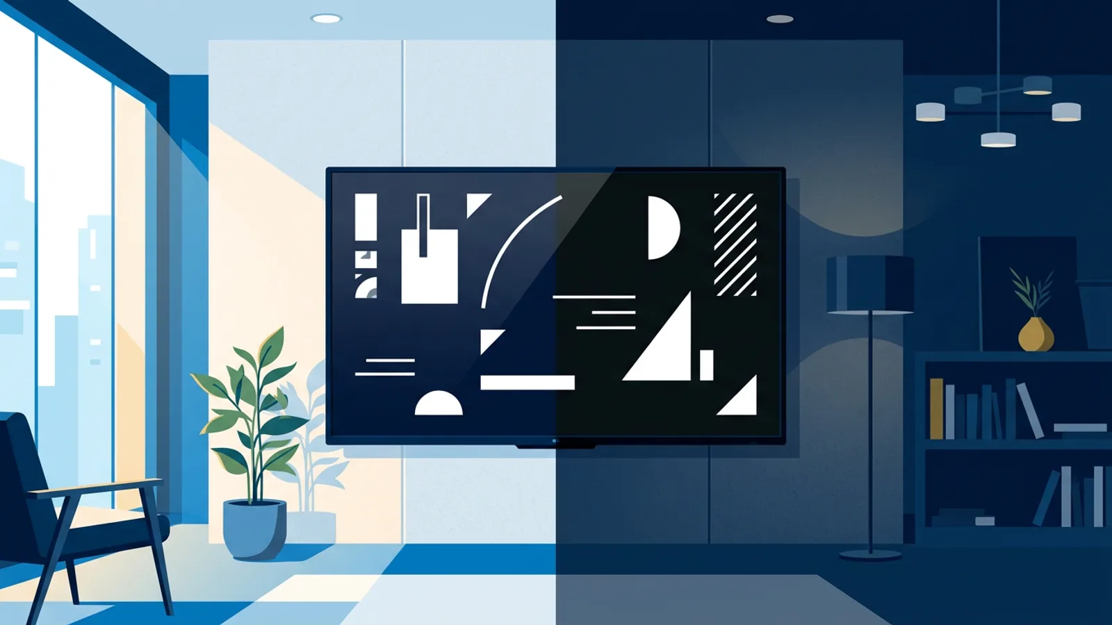
A palette that works in a dim back office will wash out completely under fluorescent lights or beside a sunlit window. Before finalizing colors, think about where the screen physically lives:
- Direct sunlight or large windows: avoid mid-tone backgrounds entirely, go for maximum contrast (pure black or pure white base) and boost text size, since glare reduces effective contrast regardless of your color choices.
- Dim hallways or waiting rooms: pure white backgrounds at full brightness can feel harsh at night; a dark background with light text is more comfortable and often reads just as well.
- Retail floors with mixed lighting: test at the time of day when the sun angle is worst, not just when you're designing at your desk.
If the screen also needs to power on and off on a schedule to match business hours, that's a separate but related project, covered in how to schedule a TV to turn on and off automatically.
Color choices beyond contrast
Contrast gets people talking about black and white, but full-color digital signage colors have their own pitfalls:
- Saturated red and green together are hard on colorblind viewers (roughly 1 in 12 men have some form of red-green color vision deficiency) and can look muddy on cheaper panels regardless.
- Pure red text on pure black looks great in mockups and terrible in person, because red has lower perceived brightness than white or yellow at the same luminance value, so it reads as darker and smaller than it is.
- Gradients as backgrounds behind text are risky, since the contrast ratio changes across the gradient and text can become unreadable in one section even if it's fine in another.
- Brand colors that are naturally light (pastel pink, light blue, pale yellow) generally shouldn't be used as a background for anything but the largest headline text.
If you're not confident picking a palette from scratch, using a template or an AI-generated layout that's already been checked for legible contrast is a reasonable shortcut. We wrote a comparison of the two approaches in digital signage templates vs AI-generated designs, and a broader set of readability rules in digital signage design best practices.
A simple pre-launch checklist
Before pushing a new design to your screens:
- View it on the actual TV model you'll deploy to, not just a monitor, if at all possible.
- Check it at the room's worst lighting moment (midday glare, evening dim).
- Stand at your farthest expected viewing distance and see if you can read it without walking closer.
- Check contrast ratios for every text/background pair, not just the main one.
- Test on both a cheap and a higher-end panel if your fleet is mixed hardware, since rendering varies more than people expect.
When TVpilot is, and isn't, the right fit for this
TVpilot won't fix bad color choices for you: it's a scheduling and playback dashboard, not a design-rules engine, so a low-contrast image you upload will play exactly as low-contrast as you made it. Where it does help is the AI Studio feature, which generates signage screens (promos, menus, hours, welcome screens) from a short brief, and tends to produce reasonably high-contrast layouts by default since that's what most business signage needs. It also lets you preview and swap content quickly across a fleet of screens from one dashboard, which makes it faster to catch a bad color choice on one screen before it spreads to twenty.
If you need offline playback with no internet dependency at all, or you specifically want self-hosted, open-source software, TVpilot isn't the right tool, since it's hosted SaaS and players need a connection to receive updates. For most small businesses running a handful of screens with playlists of images, videos, menus, or web pages, it's a straightforward way to manage what's on screen without touching each TV by hand.
Getting the palette right is half the job of a readable sign, the other half is making sure the right content is playing on the right screen at the right time. If you want to test your own color choices on a real screen without wiring up a full setup first, sign up for a free TVpilot account and try a design on an actual TV before you commit to it across your whole location.
Frequently asked questions
What contrast ratio should digital signage text use?
Aim higher than the standard web accessibility minimum of 4.5:1. For signage viewed from a distance, target at least 7:1 between text and background, and go for near-maximum contrast (close to pure black on white or white on black) for anything meant to be read at a glance, like prices or headlines.
Why do my colors look different on the TV than on my computer screen?
TVs are typically tuned for video content with boosted saturation, contrast, and sharpness compared to computer monitors, and panel quality varies a lot between price points. Subtle color differences, pastel tones, and fine gradients that look fine on a monitor often become muddy, oversaturated, or hard to read once displayed on an actual TV panel.
Is black background with white text always the safest choice for digital signage?
It's usually the safest default because it produces maximum contrast and reads well in both bright and dim rooms, but it's not mandatory. A dark navy background with warm white text can look softer for lobbies, and white backgrounds with dark text work well in consistently bright rooms, as long as you check for glare and backlight bleed.
Does digital signage software like TVpilot fix bad color contrast automatically?
No. TVpilot manages playlists, scheduling, and playback across screens, but it displays whatever content you upload exactly as designed. Its AI Studio feature tends to generate reasonably high-contrast layouts by default, but if you upload your own low-contrast image or design, it will play as-is.