KPI Dashboards on Digital Signage: What Belongs on the TV
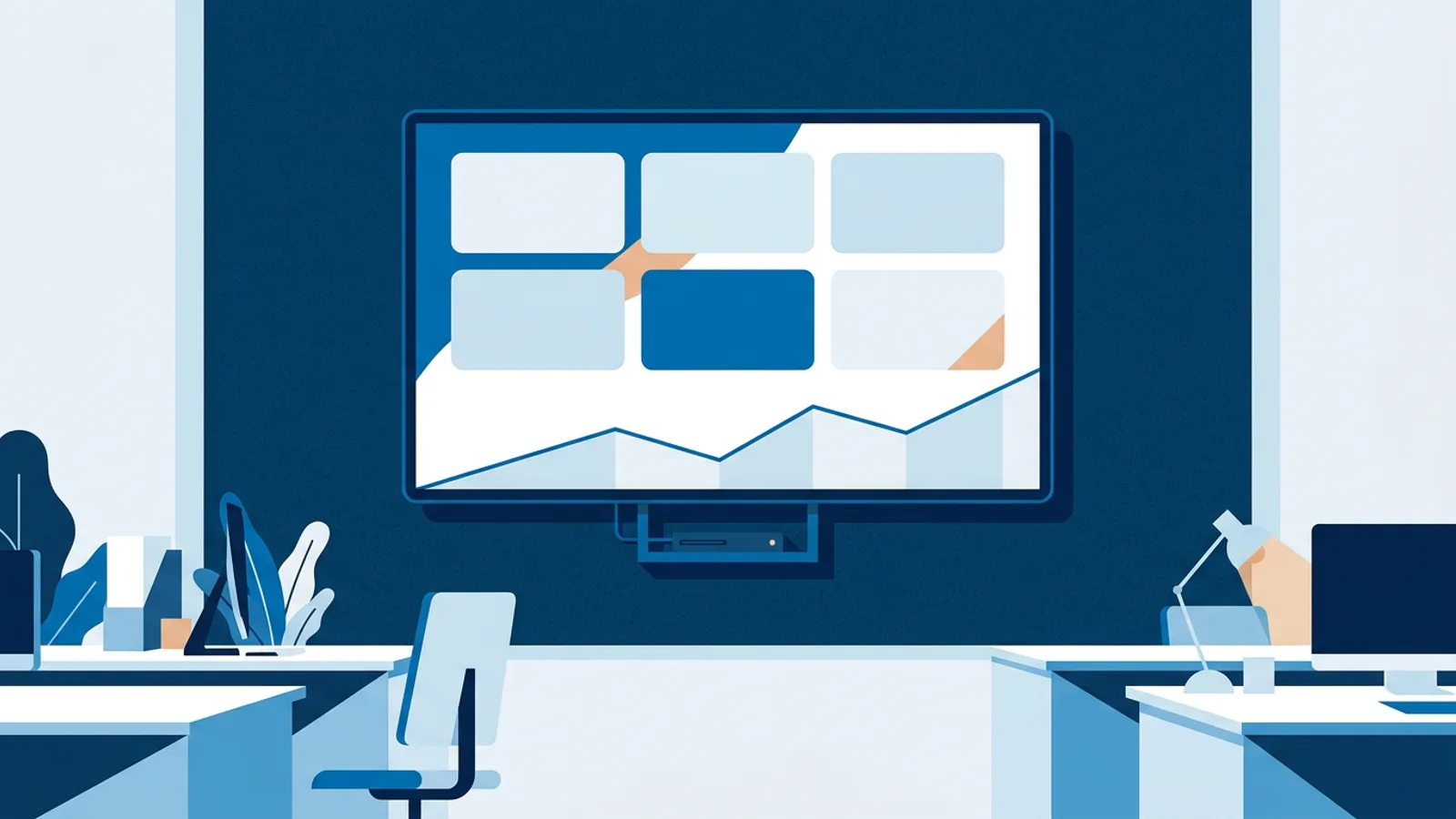
A KPI dashboard on digital signage earns its wall space when it shows four to six live numbers that someone in the room can act on today: the support queue, orders today, revenue against target, open picklists, invoices past due. Monthly trends, long tables and per-person rankings belong in the dashboard tool people open at their desk.
This guide is for the office manager or team lead who has a TV on the wall and a boss asking for "the numbers" on it. It covers which KPIs to pick, how to lay them out so they read from 5 metres, how often they should refresh, and the three practical routes to get data onto a screen.
If you already know where your data lives, the TV dashboards overview lists which support desk, webshop, payment and finance tools TVpilot connects to directly.
Which KPIs belong on a KPI dashboard for digital signage
Run every candidate number through three questions:
- Does it change during the working day? If it only moves once a month, a TV is the wrong place for it.
- Can someone in the room move it in the next hour? "Unassigned tickets" passes; "customer lifetime value" does not.
- Is it obvious when the number is bad? A KPI needs a threshold the team agrees on, or it is just decoration.
Numbers that pass all three tend to look like this:
| Team | KPI for the wall | What someone does when it crosses the agreed bound |
|---|---|---|
| Support | Open and unassigned conversations | Picks up the oldest unassigned ticket |
| Support | First reply time today | Pulls a colleague onto the inbox |
| Webshop | Orders today | Checks checkout or a campaign if it stalls |
| Webshop / finance | Revenue today vs target | Pushes a promotion or flags it in stand-up |
| Warehouse | Picklists waiting to be picked | Moves a packer from returns to picking |
| Finance | Invoices past due | Starts the reminder round |
For support teams specifically, our seven-number support wallboard guide goes deeper on which queue metrics matter.
The decision rule: if a number fails question 2, drop it. If two numbers trigger the same action, keep the one that reacts faster.
How to lay out a dashboard for a TV read from 5 metres
A desktop dashboard assumes you are 60 centimetres away with a mouse. A wall screen is read in a two-second glance from across the room, so the layout rules change.
- Four to six tiles maximum. With more, every number shrinks below what reads at a distance.
- One big number per tile, with a short label above it ("Unassigned", not "Number of unassigned conversations in all mailboxes").
- At most one trend line on the whole screen, for the KPI where direction matters more than the value (orders per hour, for example).
- Agreed amber and red bounds instead of explanations. As a team, decide that more than 10 unassigned tickets is amber and more than 25 is red, and write those bounds down where everyone sees them (in the stand-up notes or on a card next to the screen). The bound is a team convention; the screen only has to show the number big enough to compare against it.
- No tables. Rows of small text are unreadable at 5 metres and nobody walks up to read them.
Some quick arithmetic shows why. A 55-inch TV has a picture roughly 68 centimetres tall. Split it into two rows of three tiles and each tile is about 34 centimetres tall. If the number takes 40 percent of the tile height, it is around 13 centimetres tall, which reads comfortably across an office. Squeeze in three rows of four tiles and the same number drops to about 9 centimetres, with labels that shrink to a size people have to squint at.
If one number matters far more than the rest (usually the queue or revenue against target), give it more room by showing fewer tiles on that screen, or put it on its own slide in the playlist.
How often should a TV dashboard refresh?
Minutes, not seconds. Nobody in the room reacts to a number within ten seconds, and polling a support desk or webshop API every few seconds burns through rate limits and can get a key throttled. A number that flickers constantly also trains people to ignore it.
Sensible intervals by data type:
- Support queues: every few minutes, because a ticket waiting is the most time-sensitive thing on the wall.
- Orders and revenue: around every 10 minutes is plenty for decisions made over an hour.
- Finance and BI reports: every half hour or slower; invoices past due do not change minute by minute.
If you need second-by-second numbers (a call centre with live calls in queue, say), use the phone system's own wallboard instead.
Three ways to get a business dashboard onto a TV
1. A dashboard tool with a TV mode
Many BI and dashboard tools have a full-screen or kiosk view. You open it in a browser on a computer or stick behind the TV and leave it running.
This is fine if you have one screen and the tool already holds all your numbers. The weak points show up over weeks: the browser session expires and the TV shows a login page, a software update leaves a popup over the dashboard, and nobody notices because nobody checks the screen remotely. You also cannot rotate the dashboard with other content, like a welcome message or the lunch menu.
2. A published Power BI report
If your numbers live in Excel, a SQL database or an ERP, Power BI is the most practical bridge. You build the report in Power BI, publish it to the web (File, Embed report, Publish to web) and paste that link into a signage player.
The catch is security. Publish to web makes the report viewable by anyone who has the link, so only put wallboard-safe totals in it, never customer names or salaries. Authenticated share links cannot play on an unattended screen; TVpilot rejects them with an explanation rather than showing a login page on the TV. Microsoft documents the details in its Publish to web guidance.
3. A signage platform that connects to the source directly
The third route skips the dashboard tool. The signage software talks to Help Scout, Shopify or Moneybird itself, using a key you paste in, and draws TV-sized tiles from the numbers.
In TVpilot the direct sources are Help Scout for support; Shopify, WooCommerce, Magento, Lightspeed and bol.com for webshops; Mollie, Stripe and SumUp for payments; Moneybird for invoicing; and Picqer for the warehouse. What reaches the screen depends on the integration. The Help Scout dashboard sends only totals to the screen, so no conversation contents or customer names end up on a TV. Mollie and Stripe connect with one read-only API key, and Moneybird with one read-only personal API token. On the webshop dashboards you choose which tiles to show, so a screen customers can see, such as a shop floor, can show open orders and best sellers and leave the revenue tiles off.
Which route to pick
| Your situation | Best route | Why |
|---|---|---|
| One screen, one BI tool that already has everything | Dashboard tool TV mode | Least setup, no extra software |
| Metrics in spreadsheets, SQL or a mix of systems | Published Power BI report | TVpilot has no native connector for your own database |
| Numbers live in a support desk, webshop or finance SaaS listed above | Signage platform with direct connectors | No BI report to build or maintain, TV-ready layout |
| Dashboard must rotate with other content or run on several screens | Signage platform (direct or Power BI) | Scheduling, monitoring and remote fixes |
The honest limit of route 3: if your KPI is a spreadsheet formula or a SQL query, there is no native connector for it. Publish it through Power BI and play that report as a slide.
Worked example: a webshop office with two screens
Say you run a webshop with 15 people: a support desk of four, a small warehouse and an office. Your stack is Shopify, Help Scout, Picqer and Moneybird. You have two TVs: a 55-inch in the office, read from about 5 metres, and a 43-inch above the packing tables.
Office screen, six tiles:
- Help Scout unassigned conversations (the team agrees that above 10 is amber).
- Open conversations.
- First reply time today.
- Shopify open orders.
- Shopify revenue today.
- Moneybird overdue invoices.
The finance team wants revenue against a monthly target with a trend line; that combination lives in their spreadsheet, so they publish a one-page Power BI report and add it as a second slide that shows for 20 seconds every few minutes.
Warehouse screen, three tiles: Picqer picklists waiting, open orders and backorders. Three tiles on a 43-inch screen keeps numbers large enough to read while carrying a box.
Hardware: a Raspberry Pi 4 behind each TV, set up with the one-command installer and a 6-character claim code. A smart TV with a decent browser pointed at the player URL works too if you would rather skip the extra box. The Pi has one advantage for an office: it switches the TV to standby via HDMI-CEC outside office hours.
Cost: the Free plan covers one screen; two screens fit on Starter at €5 per month, with every integration included. Setup time is mostly spent finding API keys in each tool's settings.
Failure modes that sink TV dashboards
- Too many tiles. The board starts with five numbers and grows to fourteen because every department wants in. Hold a hard limit per screen and give a second screen or a second slide to anyone who argues.
- Numbers without thresholds. If nobody agreed what "bad" looks like, the board turns into wallpaper within a month.
- Revenue on a customer-facing screen. On a screen visible from the shop floor or reception, choose count tiles such as open orders and leave revenue tiles off.
- Over-sharing in Power BI. Publish to web is public. One forgotten customer table in the report is a data leak.
- A dead screen nobody notices. A frozen browser can show yesterday's numbers for a week. Use a player with remote monitoring; see our guide to digital signage screen monitoring.
- Refreshing every few seconds. You gain nothing and risk hitting API limits.
When TVpilot fits, and when it does not
TVpilot fits if your KPIs live in Help Scout, Shopify, WooCommerce, Magento, Lightspeed, bol.com, Mollie, Stripe, SumUp, Moneybird or Picqer, or in a Power BI report you can publish to the web, and you want the dashboard to share screens with other content, run on cheap hardware, and be managed remotely.
It is the wrong choice if your numbers must stay behind a login (authenticated Power BI links cannot play), if you need second-level refresh for something like a live call queue, or if you require self-hosted software, since TVpilot is hosted only. If your BI tool already has a reliable kiosk mode and you only have one screen, that may be all you need.
Get your first KPI board on a screen
Pick the four to six numbers your team can act on today, agree the amber and red bounds as a team, and connect the sources. You can build the board on one screen with the Free plan, no credit card needed: create a TVpilot account and add your first dashboard tile.
Frequently asked questions
How many KPIs should an office TV dashboard show?
Four to six per screen. On a 55-inch TV, two rows of three tiles keep each number around 13 centimetres tall, which reads from across an office. More tiles shrink every number and label, so put extra KPIs on a second slide or a second screen instead.
Can I show Excel or SQL numbers on a digital signage TV?
Yes, through Power BI. Build a report on your spreadsheet or database, publish it with File, Embed report, Publish to web, and paste the link into your signage player. Publish to web makes the report public to anyone with the link, so include only wallboard-safe totals.
How often should a KPI dashboard on a TV refresh?
Every few minutes is right for most office screens. Support queues are the most time-sensitive and benefit from refreshing every few minutes, orders and revenue are fine at around ten minutes, and finance or BI reports can update every half hour or slower. Refreshing every few seconds adds nothing people can act on and can hit API rate limits.
Is it safe to connect my webshop or support desk to a wall TV?
It depends on the integration, so check what each one sends to the screen. In TVpilot, the Help Scout dashboard only sends totals to the screen, Mollie and Stripe use a read-only API key, and Moneybird uses a read-only personal API token. On the webshop dashboards you choose which tiles appear, so screens customers can see can leave revenue tiles off.